A New Look For Overlap Associates
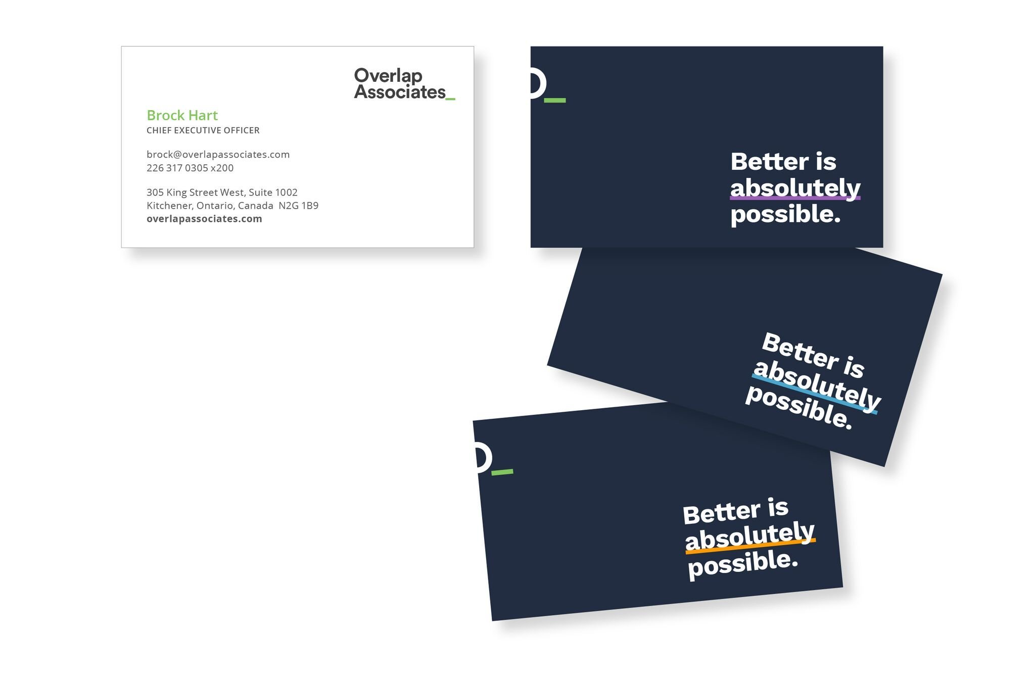
We’re thrilled to officially announce Overlap’s 2017 brand refresh.
After six years of rapid growth, we wanted to refine and refresh the existing Overlap look to create a more cohesive and polished visual brand identity.
2017 was a huge year of growth for Overlap, including the addition of 5 positions and a move to a brand new office with over double the space.
An increased demand for clean visual communication aided our decision to rebrand. Our team was in need of a refined brand for consistent communication with our customers and across our business teams.
Brand Refresh Objectives:
Create a modular visual identity that can apply to all Overlap materials for a consistent brand experience.
Create a look that’s on par with Overlap’s high-quality, professional work.
Simplify Overlap’s use of fonts, colours, and imagery.
Create an approachable and bold look that highlights Overlap’s playful side.
The underline represents Overlap’s ability to find meaning, answers, insights, missing pieces, and solutions. Our processes and tools enable us to dig in and find the valuable information our clients need to solve their toughest problems.


